If you're thnking about your next B2B web redesign strategy, it’s natural to think that you can do one huge site redesign that’ll serve you for many years to come. It’s also natural to think that your new site requires very little maintenance and will function perfectly at converting leads and selling your products and services until you do another rehaul in the future. While a part of that logic makes sense, this approach can actually be detrimental.
You’re essentially telling yourself that a complete site overhaul that you intend to leave as is for years, without any testing, updating, or maintenance, will improve your site’s conversions.
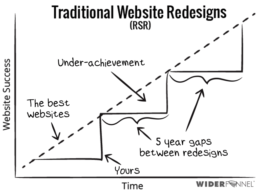
This approach to B2B web redesign is called radical or revolutionary site redesign.
This school of thought believes in making a huge design overhaul to a B2B site right off the bat and then leaving it alone. This means not testing to see how conversions have been impacted by this new design.
Such an approach is fraught with dangers and problems because not all redesign is good for conversions. If you don’t catch such design problems your conversion rates keep going down and your site keeps losing money like a leaking bucket.
What’s the alternative? Constantly testing and updating your site incrementally over time. This approach is called evolutionary or incremental site redesign.
In this article, we’ll get into the details of both B2B web redesign strategies and show you why evolutionary site design is better for your conversions in the long run.
What’s evolutionary site redesign? This is an approach to redesigning your site that doesn’t leave anything to chance, false hope or crossing your fingers.
Evolutionary site redesign is a calculating and scientific approach to site redesign that relies on testing your B2B site regularly after a site redesign.
By regularly testing your site, you can scientifically determine if the changes actually had a positive effect on site conversions, which is what you’re aiming for, anyway.
You see, if you don’t regularly test all the different elements of your B2B site—such as your landing page, logos, headers and calls to action, to name just a few—you won’t know if a redesign actually had the effect you wanted.
In other words, you’re really going at it blindly, which is no way to run your B2B site, if it’s to work as a sales tool to help you grow your business.
One noteworthy advocate of evolutionary site redesign is Chris Goward. He’s written about evolutionary site redesign for many influential industry websites, and he’s the founder of WiderFunnel, the conversion rate-optimization company that’s helped Google, Electronic Arts and a few other, big-name clients.
Goward’s point is that evolutionary site redesign lets your B2B site constantly keep up with and even surpass the success of the rest of the Internet.
In short, he’s saying that evolutionary site redesign relies on conversion rate optimization principles as the basis for a B2B site redesign. With this method, it’s hard to go wrong because you’ll always be evaluating if your site is performing the way it should.
There’s a good reason that the word “radical” is found in the phrase “radical site redesign.” Let’s look at how the good folks at Merriam-Webster define “radical”:
A radical site redesign that will change many different elements of your B2B site—landing page, calls to action, site copy, the header, etc.—in such an extreme and significant way compared to your old design.
On top of this, unless your radical redesign is made following some kind of customer-centric methodology, it can be very careless because in the excitement of a whole new “cool look & feel” it is easy to neglect any necessary, follow-up testing of the B2B site to see if the changes were positive or negative.
In other words, a radical site redesign is truly radical because it makes momentous changes to your site, but then leaves the site alone with no testing, all the while expecting it to still function like a highly effective salesperson for your B2B brand.
Such a radical redesign approach, when it’s not followed by testing is basically like throwing a desperate Hail Mary pass in football…and hoping that your wide receiver, way down the field, somehow catches the ball and makes the entire play work. That’s how risky a redesign like this can be.
Ask yourself: Would you be comfortable putting so much money on the line for a site redesign, only to potentially end up with something that causes your conversion rate to drop?
While B2B owners are certainly a varied lot, we don’t know too many of them who would be comfortable risking a lot of money just to end up with a redesign that may do more harm than good. Just sayin.
As the name implies, evolutionary site redesign is an approach to site redesign that is constantly improving.
You’ll never be stuck with just that one radical design that changed a whole bunch of elements on your B2B site—you’ll always be testing every element individually to see if lifts have occurred on your site.
This can be anything from your clickthrough rate to leads to your actual conversions.
Unsurprisingly, there are many different benefits of an evolutionary site redesign:
It’s a lot quicker – Evolutionary site redesign is a process that takes a far shorter period of time than a radical site redesign. That’s because essentially it targets specific problems by creating hypotheses and always testing your site after every specific design changes, so you’ll be getting feedback about the changes much faster.
Results are measured – Controlled a/b testing is performed after every site element change. For instance, let’s say that you change the landing page copy on your B2B site. An a/b test is run for each redesigned element so that you determine with certainty if the design change had a positive effect or not.
Contrast that with a radical site redesign where, sometimes, only the useless “gut feeling” of the designer is taken into consideration.
It produces a better user experience – We’ve often stressed how integral the user experience is to a highly successful B2B site. Well, evolutionary site redesign takes this to heart and ensures that the user experience doesn’t suffer. This means that your buyers won’t be subjected to a radically revamped site.
Your B2B site never falls behind – Because of the continuous testing done on your site, you’ll be able to spot problem areas (conversion rate drops, higher bounce rate, landing page abandonment, etc.) immediately.
This means that you can implement any necessary changes to fix said problems immediately. As a result, your website benefits from continuous improvements, thus allowing it to stay ahead of the pack.
It gets rid of inter-company disagreements – Too many times, different people in a B2B company will be at odds over what new concept to implement and what to change from the old design.
The marketing guys may want to focus on the calls to action while the web designer is absolutely convinced that the answer to increased conversions lies in using the latest, new design trend.
Since evolutionary site redesign relies so much on a/b testing, it’ll be easy to justify implementations or changes. A bonus is that your team will stay focused on vital business metrics instead of getting into fights over site aesthetics.
You get superior budget control – Under evolutionary site redesign, site design is looked at as something you’ll always have to budget for. This is in contrast with radical site redesign, which looks at site design as a periodic capital expense.
Because of this distinction, budgeting issues like the dreaded scope creep can be avoided since everything is planned out better. As a result, you won’t be subjected to unreasonable and unexpected increases in your budget.
Basically, if your website sucks, you are better off doing a radical redesign following a customer-centric methodology. Never ever do a radical redesign without your buyer in mind because then you’ll be pretty much risking all of your investment.
So here is a short list about when you should consider a radical redesign:
Your site hasn’t been touched for years
Your site no longer reflects what your company does.
Your site just doesn’t work - there’s practically no lead generation happening .
You have loads of new buyer information that need to be integrated into the site.
The conversion objectives of your site are not well defined, so there is not one place to improve.
You have user feedback that they are getting confused on your site, and there is no way to address that with evolutionary redesign.
Wrong reasons to consider a radical redesign:
Because you feel that _________ (fill the blank with anything - your site redesign is not about feelings).
Your CEO doesn’t like the way your site looks, although it’s generating quality leads already.
You haven’t set any conversion goals in mind for the redesign - how would you ever determine if the new site is successful or not?
The condition for radical redesign to be effective? Do it only if your buyer needs and data (not your personal opinons) are at the center of the redesign, and... you don’t stop there.
Think about a radical site redesign as the first step to be followed by evolutionary redesign to continually improve your site.
So, If you already have some traction with your site and are still considering a radical vs evolutionary redesign you need to consider the risks...
First, if your site is already generating some kind of quality leads, consider the possibility that the radical redesign does not result in an uplift (as in more leads, higher conversions, etc.). If this was the case then you’re stuck with not knowing what to test to find out the reason behind the underperformance.
Heck, even if you experience a lift, you won’t be able to garner any all-important insight into what was behind the lift. Was it the new landing page copy, the new microcopy, perhaps, or maybe just the placement of navigation menu?
For starters, a radical site design subjects your site to long intervals between any redesigns. That’s because you’re not testing continually to keep your site well-performing, and, as a result, it’s going to fall behind its competitors and the rest of the web.
If there are problems that lead to site underperformance, guess what? They’re not going to get caught until the next radical site redesign…which is likely years off in the future. That’s not a savvy move at all, especially with revenue at stake.
Next, a radical site redesign might be bound to emphasize too much focus on merely the aesthetics of your B2B site, leaving no room for other, more important considerations. When you focus solely on how your site looks, you’re neglecting so many other factors that all contribute to a highly effective B2B site. These include factors like:
User experience
Readability of copy
Navigation
Next-step clarity
Videos
Images
Landing pages
Finally, you don’t learn anything at all. You’re no closer to discovering exactly what led to conversion changes (either positive or negative) before or after a radical site redesign. That’s because you’re not testing everything frequently, which you should be, though.
Further, when you fail to learn anything about what worked or didn’t work, you also fail to learn about your B2B buyers, which is the real disaster. When you fail to learn about your B2B buyer behavior, you’re losing a marvelous chance to gather data to build a high-converting B2B site.
Still not entirely convinced that a radical site redesign is just too risky for your B2B site, especially with so much money on the line? Let’s take a look at this example.
We’re talking about none other than Digg. You may remember Digg, if you’ve enjoyed visiting news aggregators and websites of that ilk. It has been credited with inspiring even more successful social networking sites like reddit, which feature voting and submission systems.
Basically, Digg was going strong from its start in 2004 all the way up to its peak in 2008, when it averaged about 236 million visitors each year; the so-called Digg Effect was even coined to explain Digg’s influence on driving traffic to sites that were featured on its homepage.
However…all that came crashing down in 2010…when Digg’s leadership team made the awful misjudgment to go through with a radical site redesign.
When Digg went through a massive site overhaul in 2010, it actually suffered a whopping and mind-blowing 26% loss of site traffic. Catastrophic doesn’t even begin to describe how terrible the consequences of that radical site redesign were.
The moral of the story is this: If your site is already working and you change how your site looks and its user interface too drastically without testing it, then you destroy the user experience and ruin a once-good thing.
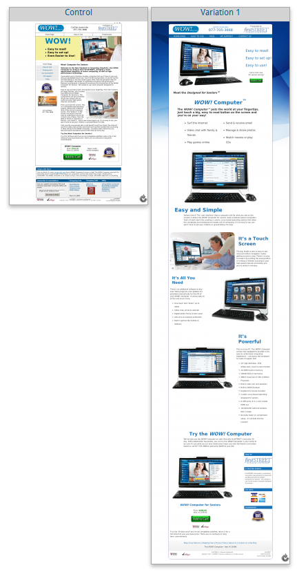
That said, not every single example of a radical site redesign is bad. To illustrate this point, we bring you this case study involving a landing page treatment for firstSTREET, a company that markets to Baby Boomers.
Now, a case study is a singular example that doesn’t overturn anything that we’ve been saying in this blog post up to this point. However, we include this case study here as food for thought because it does show that, when it’s well studied and researched, a radical site redesign can produce positive results.
According to the Marketing Sherpa case study, firstSTREET was successful in increasing its landing page conversion rate by a surprising 3566% after doing a radical site redesign on its landing page.
However, it should be noted that the basis of this particular radical site redesign was to make the whole landing page a lot simpler. Therefore, it’s no surprise that conversions increased since minimalism in web design is a winner no matter how you cut it.
There you have it. Evolutionary site redesign versus radical site redesign…you be the judge. We’ve given you all of the pros and cons behind each unique approach, and we think we’ve made a good case that:
Evolutionary site redesign is the way to go when your site has already some kind of baseline performance. After all, you want to be sure that all of that time, money and effort you devote to a redesign actually pays dividends in the short and long term.
Radical site redesign is the way to go if your current site sucks and little can be salvaged. If your entire messaging is wrong and the site is unappealing - you won’t gain much by A/B testing the top value proposition and wait for statistical significance...it will take you a decade to get your site in shape. So in this case do a radical, and follow it by evolutionary.
Just remember that evolutionary site redesign means that you’ll be testing various elements on your B2B site. These should include:
Copy
Logos
Header
Tagline
Imagery
Calls to action
Landing pages
Homepage design
Site-wide design style
Product page templates
Lead generation web forms
Value proposition statements
If you are getting some results from your site, with a radical site redesign you’re really getting a wild card. At best, you’ll get results that you can’t get to the bottom of or make sense. At worst, you still won’t understand anything about your B2B buyers or your site performance…and you’ll lose a whole bunch of money. Not smart.
Have evolutionary design given you results? Do you mind sharing?
What about a radical site redesign, has it worked for you? In what situations?