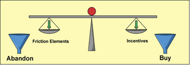
In the B2B world, the word friction can be defined in slightly different ways, but all definitions agree that it’s bad for your business. Friction is anything that contributes to making it harder and more painful for your buyers to go through a buying process on your website. In short, it’s essentially any factor that puts obstacles in the way of a smooth and comfortable user experience.
According to a popular definition from Marketing Experiments/MECLABS, friction is simply the psychological resistance to any given element in your sales process (or the user experience from the viewpoint of the buyer). It’s also a scientifically measurable amount of time in the user experience that is dictated by both the length and difficulty of that experience.
Much research has been done into reducing this aggravating friction. The result always shows that reducing the friction leads to better user experience, which in turn leads to greater conversions. For instance, UBM Canon , a B2B media company, reduced the friction in client QMed Daily’s email newsletters that resulted in a 114% increase in the desired behavior of ad click-throughs.
To be successful as a B2B company, your team has to be on top of every element in your site’s user experience, so you can identify the points of friction and nip them in the bud. It pays to explore the differences between a low- and high-friction user experience to determine what works and what doesn’t.
As a B2B company, your website must have conversion goals: that’s to get site visitors to follow through on the call-to-action and its following landing page. In the B2B environment, this is mostly lead generation (as opposed to capturing new customers as in an eCommerce site). How clear-cut you make this call-to-action for your buyers will determine whether you’ve created a low- or high-friction user experience.
A low-friction user experience includes a call-to-action that is precisely worded and doesn't end up creating uncertainties or fears. It has to clearly express what they will receive in return for taking the time out of their day to input their personal information on your landing page. Your landing page should make things as easy as possible for buyers.
Remember: A low-friction user experience reduces customer pain points as much as possible. When writing a call-to-action, never write it so badly that it fails to clarify exactly what buyers will get for providing their personal information. Avoid words and phrases like “submit” or “click here.”
More often than not, low click through rates an CTAs have more to do with the user not knowing what will happen after the click than anything else. In other words, when the user experiences click fear , kiss good click-thru rates bye bye.
Lack of planning and thought can create a high-friction user experience on your landing page. By making the forms that buyers have to fill out longer than they have to be, you create more friction for buyers. Not including a reassuring privacy statement close to the call-to-action button will also increase friction for buyers.
The navigation menu on your landing page is distracting when your B2B website is looking to generate leads through conversions. This relates not only to the navigation menu at the top of a page, but it can also refer to the navigation in the footer and along the sides of the page. A low-friction user experience will feature no navigation menu on the landing page.
The whole idea behind this removal is to increase the chances that your buyers remain on the landing page in the first place. You can streamline your user experience by removing the navigation menu and, therefore, making sure that your buyers aren’t tempted to leave your landing page for another page on your site.
Studies have shown that removing the navigation menu from the landing page increases a B2B site’s conversions. This B2B company increased its conversions by 100% just by removing the navigation menu from its landing page.
The high-friction user experience would totally ignore the great benefits of having no distracting navigation menu on the landing page. It would maintain said navigation menu on top, along the sides or on the bottom of the landing page. As a result, conversions--such as buyers simply inputting their personal information--will drop. This is not a successful way of running your B2B website.
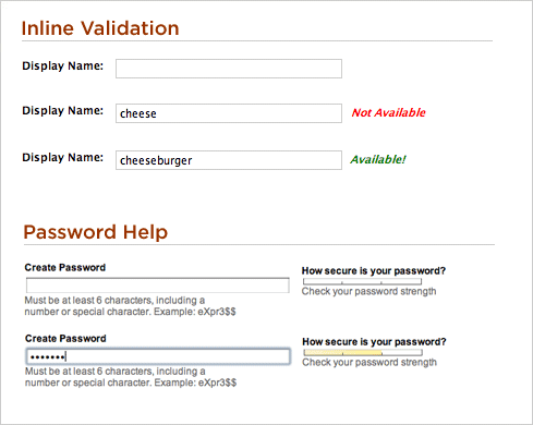
Some of the biggest creators of friction in the user experience are those pesky web forms. Who wants to spend valuable time filling those out, right? Complicated web forms that are really longer than they have to be are one of the primary agents of friction in the user experience. By simplifying your web forms , you’re doing away with unnecessary pain points for your customers.
Simpler web forms are an integral component of a low-friction user experience. So what can you do? Just reduce the actual number of fields in your web forms that you expect buyers to fill out and see how your conversions increase.
In addition, the complexity of the forms is, naturally, a problem, too. Examples of elements that make forms harder than they have to be are unclear buttons, problematic pull-down menus or even an absence of error-managing messages. Get rid of these.
B2B companies that subject buyers to aggravating requirements like registering before they can sign up for, in example, a free ebook, are causing a high-friction user experience for their buyers.
Studies have concluded that making web forms more complicated has a severely damaging effect on conversions.
So many times, the user experience closely ties into the buying process.
If the user experience is clunky and frustrating, then buyers will be tempted to discontinue the buying process. A bad user experience on your site must be avoided at all costs by incorporating some of these tips .
Here’s how you create a low-friction user experience:
You don’t have to be a marketing guru with years of experience to identify the troublesome friction on your site and get rid of it once and for all. According to friction-reduction expert Dr. Flint McGlaughlin, the CEO of MECLABS, B2B companies can easily spot the most vital elements on a webpage that can impact friction one way or another.
These elements are:
If any of these elements is off, it will result in a high-friction user experience that will be the scourge of conversions on your site.
If forms ask for too much information or are too complicated to fill out, buyers will think twice about providing their personal information to you. If the headline copy is hard to read or unclear, buyers may not understand where their attention should be directed. If your call-to-action is positioned in a place on the page without a logical follow through, then buyers are less likely to complete the conversion.
Should the page’s form layout be poorly thought out, then your buyers will be discouraged from showing further interest in your product or service. Finally, if user navigation is so bad that buyers find it hard to determine how to submit a form, conversions will drop, too. All of these issues have to be improved to create a low-friction user experience.
Conclusion: Focus on creating a Low-Friction Experience at Any Cost
The long and short of it is that in B2B it is even more critical to implement a low-friction user experience on your website. In most B2B lead gen sites the whole point is to grow a list of qualified buyers, so why make it difficult?
This is the difference between successful conversions and buyers your company will lose because they encountered obstacles in their learning process; a poor user experience that simply could have been avoided in the first place. These days, there just isn’t an excuse anymore to have a high-friction user experience that you’re subjecting your buyers to.
Solid case study after case study has demonstrated that B2B companies that reduce friction will always succeed in obtaining more conversions. One such case study from the Marketing Experiments Blog showed that conversions for a B2B company that dealt in business VOIP telephone services shot up by a whopping 262% when friction was reduced on its sales page. This was done by transforming the company’s sales call form to a quote tool that was interactive.
Buyers are precious, which is why you don’t want to suck them down in a high-friction user experience that just wastes their time. If this happens, your conversion rates will drop and your company will suffer.
Always focus on creating a low-friction user experience and your inbound marketing efforts will have a better payoff.