LIVE Website Performance Evaluation
Find Out Why Your Site Isn’t Converting And How To Fix It.
Our conversion experts will critique your site in just 30 minutes -- for free. And, you’ll walk away with actionable tips to boost conversions.

Discover why your website isn’t landing as many qualified leads as you’d like...
Because even if your site is...
Pretty -- you make use of product screenshots and professional illustrations to break up and elaborate on your copy.
User friendly -- it’s simple to navigate around your site, your typography is easy on the eyes, and the experience is just as good across devices.
On trend -- the second someone lands on your site, they can tell that it was designed within the last year or two.
Loaded with best practices -- you’ve got a unique selling proposition, benefit-driven copy, social proof, conversion goals, and more.
And even if you’ve just spent tens of thousands of dollars on a complete website redesign…
You may still be falling short where it counts: signups, demos, and paying customers.
Your pretty, user friendly, on trend, best-practice-following, brand new website won’t convert unless…
...every website architecture, design, and copy decision maps perfectly to your ideal customer and the conversion pathway they want to take.
Your value prop must be crystal clear
That means you need to meet your ideal customer where they are right now, and make it easy for them to find everything they need to feel motivated enough to sign up or contact sales.
Exactly how this looks depends on who your customers are, who makes the buying decision, what your product is, who your competitors are, how much your product costs, and so much more.
Your value prop is unique to your business
The optimal solution, the one that will have the most impact on conversions and your bottom line, is different for your business than it is for any other -- even your competitors.
Imagine using the same strategy to sell a simple $25/month SaaS subscription and enterprise software costing thousands of dollars each year -- it wouldn’t work. Or, try targeting a CMO, CTO, and Marketing Manager with the same message -- again, it wouldn’t work.
There isn’t a one-size-fits-all “hack” to land more leads and sales …
But there is a proven framework to solve this problem -- it’s called FOCUSED™ -- and we’ve used it to help grow over 200 B2B companies...

Find Out What's Preventing Your Conversions
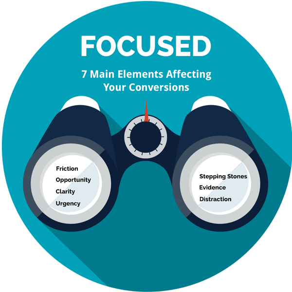
Your site will be benchmarked against 7 main elements that affect your website's ability to generate leads and close deals:
Friction
Are there reasons for the buyer to have fears, uncertainties and doubts around your ability to deliver on your promise?
Opportunity
Are there opportunities for the buyer to engage with clear and noticeable calls-to-action?
Clarity
Is it easy to understand what your product or service is, who it’s for, and how you do it better?
Urgency
Are there reasons for your prospects to sign up and buy sooner rather than later?

Stepping Stones
Is the path to conversion easy for your prospects to navigate? Or, are they getting lost along the way?
Evidence
Is there enough social proof to ease your prospect’s anxieties and squash their objections to your offer?
Distraction
Is the visual and information hierarchy well-established? Or, are there unnecessary elements distracting your prospects from the main goal?
What our customers are saying


Pick our experts’ brains for 30 minutes [free of charge]
In just one 30-minute call with our experts you’ll pick up specific recommendations to boost your site’s performance and land you more qualified leads. This is advice that we typically charge at a rate of $350/hr.
A typical review includes a critique of the pages most likely to be seen by your buyers when they visit your site. For example, we’ll help you answer questions such as:
- Is your site too heavy or light on benefits and features?
- Does your site contain too much information, too little information, or not enough of the right information?
- Are you providing the ideal entry point for customers, whether that’s a free trial, demo, freemium model, or something else entirely?
- Do you offer the right amount of educational content based on your buyer’s current level of awareness?
- Do you have a reliable lead magnet that converts the right people on their first visit (besides your free demo)?
- And more...
Here’s what industry leaders are saying about the experts who will conduct your live evaluation:

Only 5 FREE sessions per month
As with all things that are both valuable and free, these sessions always go fast.
Only 5 Evaluations left this month
Each evaluation is an insightful analysis focused on the specifics of your business, goals, and website. You’ll walk away with valuable information that typical design firms charge money for - free.
How do I get my website evaluation?
- Fill in the short form here to give us some context prior to our call
- Schedule a 30-minute call directly in our agenda. Or, if you prefer, you can request your evaluation report via email and our experts will send you actionable recommendations to improve your site.
- Walk away with valuable information that typical optimization firms charge money for -- free.
And no, you aren’t signing up for a sales call. This call is a sales pitch free zone.
Tell us a bit about your company
No thanks, I'm not interested in improving my site right now.
Over 200 marketers have trusted Market 8 to improve their marketing performance
From startups to enterprise software firms like Siemens PLM -- we’ve improved conversion performance for companies of all sizes.


