The call to action button is the actual star of your B2B website when you really think about it. It is the culmination of your site’s carefully laid-out information architecture and clearly mapped-out goal: to get site visitors and leads to convert.
A bunch of factors matter to the creation of a potent call to action button:
According to MECLABS’ Director of Content, Daniel Burstein, referring to the call to action:
“Subtle changes in words can make a significant difference in performance.”
You got that right. Your B2B website’s call to action button can be made or broken by specific choices you make when designing your pages. Should you eliminate all navigation on a landing page? Do you think you’ll need directional cues to make your call to action buttons that much more obvious? As you’re beginning to hopefully see, one can almost write an entire textbook on all the different elements you should get right to design a successful call to action on your site. That’s how intricate conversion science can get.
However, we have a treat for you today: We’re going to simplify and distill down everything you need to know about creating a high-converting call to action. That’s what our blog post’s going to deal with. At the end of it, you’ll be empowered enough to confidently make the right decisions about your B2B website’s call to action.
When it comes to getting people to read anything, it’s always a matter of successfully catching their attention and drawing their eye. This is accomplished by way of a potent headline.
Your headline typography has to be big, so that it’s easy to read from the buyer's perspective. Then, to further make it stand out from everything else—which only helps to get the buyer's attention—use a different font for the headline than any other font for text on the sales page.
An example of an eye-catching headline right above the call to action can be found on Skyjunxion: "8 Reasons Why Travel Expense is Higher Than It Should Be" which clarifies what the offer is about. The image and the red button do the rest of the trick.
At the opposite end of the spectrum sits this bad example of a call to action, that actually has a headline, but it is completely disconnected from the action button:
Image Credit
So the headline tells me about safeguarding my portfolio... but then the clickable item is "Save $150" ... huh? First, safeguarding my portfolio is worth potentially a lot... but how does that relate to saving $150? It doesn't. This lack of clear relationship forces the buyer (at least those that have the patience) to read the rest of the copy to figure out what's being offered, but even after doing that it isn't clear.
Copy is ultra-important on your B2B website because successful copy tells your buyers what they are expected to do next. So it is with the copy specifically for your call to action button. It can’t be ambiguous because that would hurt conversions; at the same time, it can’t be too long because call to action buttons have very limited space. So what do you do?
Remember that your call to action copy is the difference between a lead becoming a conversion and a lead who abandons your site. It is the crucial element; the very last thing your buyer interacts with before making that fateful decision.
Microcopy near your call to action button is something you should seriously consider, too. It is helpful in persuading your buyers to get over any last-minute hesitation that may present itself before they actually click the call to action button. Microcopy can be as simple as mentioning that your offer is free to the first 100 people who click through.
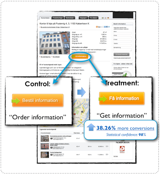
Small changes and tweaks to your button copy can yield huge changes when it comes to conversions. According to Unbounce, changing the phrase “order information” to “get information” on a B2B’s call to action button resulted in a nice lift of 38.26% in conversions. As you can see, you can’t underestimate the power of even one word in call to action copy.
In the Unbounce example, it’s clear that the use of the word “order” implies parting with your money right off the bat and a longer, possibly protracted process. When you read the simple word “get,” however, what comes across to you instead is more of an instant-gratification outcome, where you just receive the information referred to in the call to action button without any thought to money or time.
PROTIPA good rule to take away from this example is to use words that convey an instant benefit for your buyers, as opposed to words that put pictures of cost and length of time in their heads. Your conversion rate will thank you.
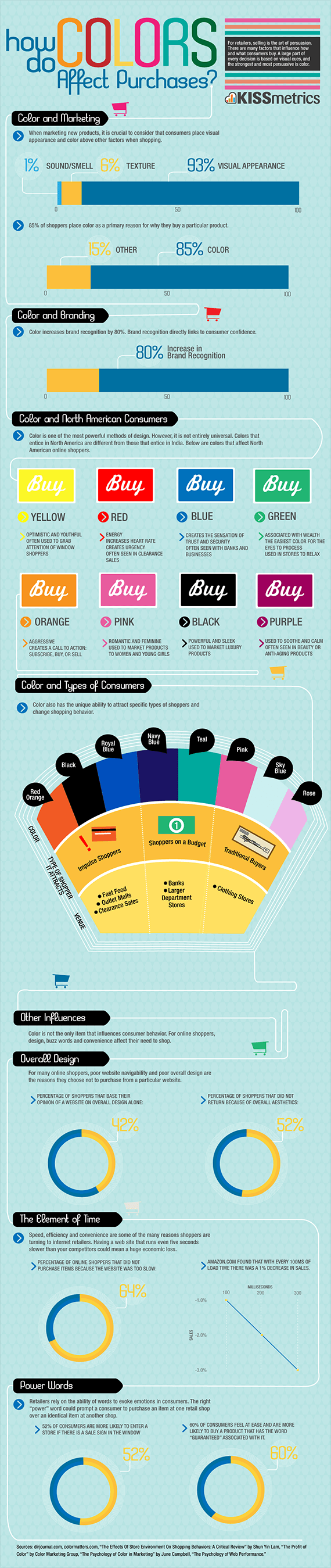
Colors have been proven to have a significant effect on the actions and impressions of consumers. This handy infographic from KISSmetrics will tell you more about what we mean. Essentially, different colors provoke different reactions in shoppers.
PROTIPYou can use this scientifically backed truth to design your call to action buttons in such a way to increase conversions like nobody’s business.
According to the infographic:
With that said, though, you undoubtedly noticed that there are many different colors in consumer psychology that are well-suited for distinct purposes.
However, when it comes to call-to-action buttons there’s not one single color for a call to action button that works the best each time to raise your conversion rate. It’s true. This is in spite of Unbounce famously getting it wrong by predicting, half a decade ago, that the future of call to action buttons would be BOB or the big orange button.
The reason you’re not seeing orange call to action buttons all over the Internet for B2Bs, B2Gs or B2Cs is because there is a plethora of factors that unites to impact whether your call to action button’s conversion rate will be high or low.
Conversion XL looked at a slew of different studies to determine, once and for all, what the best color would be for a call to action button. The conclusion? Better conversion rates on call to action buttons are not so much based on a particular color working better than another color, but, rather, on visual and informational hierarchy, as well as employing effective and stark contrast to make your call to action buttons stand out in the first place.
We’ll talk about this extremely important and interesting aspect of designing your buttons in the following section.
There is not one single color for a call to action button that works best each time; information hierarchy and stark contrast are better predictors of CTA success.
Contrast is essential to help draw the eye to your call to action button. Since the mission of your homepage or landing page will be to get users to the final step of zeroing in on your desired button, it only makes sense to make it stand out to your buyers. This is the whole point of using contrast to make your call to action buttons noticeable.
Contrast should also be thought of as a part of fundamental visual hierarchy on your pages. After all, you want to guide the eyes and attention of your buyers, like a laser beam, all the way to your call to action button. Contrast—which can employ not just color, but also contrast in shapes, sizes and patterns—informs your buyers what parts of a page are more important than others, which is their cue to pay attention.
PROTIPCall to action buttons should be in a louder and more vibrant color than the background of your page. Always. DO NOT play branding games with your CTAs. It's not about maing it look pretty, it's about making it noticeable.
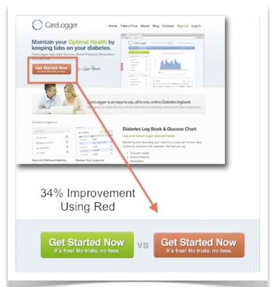
In this example of CareLogger, a service that empowers diabetics to more efficiently keep track of all of their vital information, such as blood glucose, medication and carb intake. After the company changed its call to action buttons from green to red, to stand out better against the white background of its homepage, conversions shot up by 34%. Not bad, to say the least.
Now, why did this happen? Well, they had a green button on a green/grey page... not enough contrast. The red one isn't converting more because it's red... but because it contrasts with the colors that are on the page; the red button is the only red thing in the whole page.
In this other example, Mitchell Consulting Service Group did on its “careers” page. People can search for job openings with the company by inputting keywords and picking their selections from dropdown menus.
However, the problem lies with the call to action button because it blends right into the background of the page. Instead of using color contrast to draw the eye so that job seekers can easily complete the action, the button is instead a drab gray.
Shapes and sizes can also be used to demonstrate contrast. On Cim - Team’s overview page, our eyes immediately fixate on the drastically contrasting call-to-action on the right.
The call to action button on the right uses size and shape for contrast, and this is why it is the first item that is looked at in this page:
You see the dramatic impact of contrast? The first few elements that grab your eyes are specifically the ones that have contrast (look at the red dots). As the page is scanned by the buyer, other elements where eyes fixate in this screen will be the difference in the font sizes of the opening paragraph, the headlines and the body copy. This effective contrast also makes it easier for buyers to read about who this company is and what it does. Also the "Our Guarantee" headline makes this section very scannable.
Call to action buttons on a page that don’t feature contrast can fail to stand out from the rest of the page. That’s just the case with the buttons featured on this homepage:
In every conversion page there should be always only one conversion objective- no question about that. This should be the case for every landing page.
However, there are some situations in which you'll need to present more than one option to your users, mainly because the page is presented to multiple audiences, and you are trying to present a distinct user flow to buyers in different situations. Still in this case we'd advice you to define your primary vs. secondary objectives.
A typical example of the need for primary and secondary calls to action is in the homepage banner:
Here are some things to keep in mind when establishing a hierarchy:
Where you actually position your call to action buttons can also make an enormous difference to how many conversions you get.
If you’re aiming to put your call to action button above the fold—where a good number of buttons can still be found in spite of the evolving web—you can’t let it stand on its own. It has to be supported by other vital elements on your page. Here’s how you should tackle your placement:
Put a huge, attention-grabbing headline at the top of the fold
Include a complimentary, shorter sub-headline right beneath it
Place a value proposition with some descriptive bullet points about your product or service below that
Put your call to action right besides your value statement and under the headlines
Fifth, include microcopy under your call to action that conveys a special offer or urgency statement (some also call this a “click trigger” for obvious reasons)
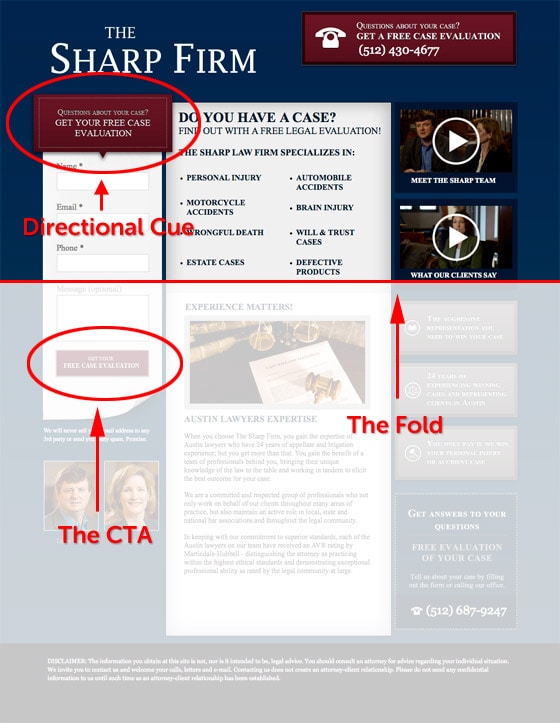
PROTIPOn a homepage or landing page, you’ll have to use directional cues when you’re working with longer forms on a lead-capture page. On pages that have longer forms, your call to action will have to be placed below the fold, which is why directional cues come in handy so much. Your best bet would be using a can’t-miss arrow that guides your buyers to scroll down the fold.
To make AIDA work, you have to follow these steps:
Attention: First, you get the buyers’ attention with a huge and captivating headline at the top of the page
Interest: Second, you get the buyers’ interest by relating to their problems in the form of something that piques their interest, like a video, under the headline
Desire: Third, beneath the interest-generating element, you spell out the features and benefits of your product or service, thus stimulating their desire
Action: Finally, the effective call to action is placed beneath the fold, as it perfectly wraps up the story you were telling on your page
Here are the big takeaways for call to action button placement below the fold:
Place your call to action button only after your supporting cast (headline, sub-headline, value proposition, bullet points) is in place
Incorporate more than one call to action button on a longer page
Utilize directional cues if your call to action is below the fold (you can still use them if your call to action is above the fold, but then it’s not so vital)
Use a storytelling technique to take full advantage of AIDA to guide buyers to your call to action button
Directional cues have always been the supporting players on a really effective homepage or landing page because they’re that little extra bit of prompting that can gently push your buyers to converting. Directional cues are either implicit or explicit.
Implicit directional cues include:
View direction
Color
Visual weighting
Repetition of color, size and shape
Prioritization
Explicit directional cues include:
Arrows
Pointing fingers
People or faces looking at calls to action (body language)
Curves
When your directional cue isn’t vivid enough or fails to point to a specific call to action button, then it’s problematic. After all, the directional cue is meant to help make your page’s user experience clearer
On Pontchartrain Partners’ homepage, buyers see directional cues in the middle of the page. The huge problem is that they’re sort of faint in color and don’t clarify what they’re pointing at. It’s only after you click on them that you realize that they offer more information about specific services the company offers.
An affordance is the possibility of an action on an object or environment. Additional meanings have developed, largely a result of misinterpretations. The original definition in psychology includes all actions that are physically possible.
When the concept was applied to design, it started also referring to only those action possibilities which one is aware of.
What matters when designing a Call-to-Action is that the button:
Remember that the top reason buttons don't get clicked is uncertainty, or lack of clarity: If the user is not sure about what's going to happen after the click, chances are he'll just not click. Clarity trumps everything, and affordances can help you improve clarity.
Some common affordances for the most common actions on a B2B website include:
Download something
Send user to a different page
Subscribe to something
Play a video
Contact by mail
Schedule something, or sign up for a timed event
Phone contact information
Chat with us now
Here is an example of how affordances would look in a button:
You can find a lot more icons in fontawesome.io, but we've found these are the most common occurrences on a B2B website.
Building on the idea of affordances, for more tangible offers make sure to follow STP. It stands for “Show The Product.” You can include a picture or a graphic highlighting what you are promoting close to the actual call to action button. This makes for a more powerful experience for the buyer, as he’ll easily be able to visualize just what he’ll be receiving after clicking through on the call to action button.
Here is a little illustration:
As you can see, the PDF little icon adds a whole other dimension to the expectation created by this call to action button. It not only tells you what you will get, it shows you.
Get the difference? That's the STP principle. If you have something to show, show it!
Now you have all what you need to successfully position your call to action buttons on your B2B website.
One thing to remember from this blog post is that your call to action button is the tipping point of a conversion event. It must be visible; it's role isn't to "match" your brand."
How it works, though, is that a well thought-out design and placement of your call to action buttons gets the conversion. As you read, it takes a lot of deliberate analysis and the consideration of many different factors to find just the perfect spot for your call to action buttons. And, of course, even when you feel right about it and the button gets you some conversions, you still have to continually test it because you can never be certain 100% that things won’t change in the future.
In spite of its small size, the call to action button is a critical conversion point in your B2B website: your homepage, your pricing page and your landing pages. Everything on your site supports it since you want your leads to understand that the goal of a page is to click on the call to action button. Only when they do has your B2B website—and your design and development process—actually done its job well.