Too many B2B companies think that all they really need is a facelift for their website. They think that that’s all it takes to get better leads and, ultimately, more people who move down the sales funnel and become actual buyers. In fact, it’s not uncommon to want to rush into design without taking into account all that has to happen before the actual design so that the site is effective.
Here is a prediction; if you jump directly into design to give your site a “facelift,” eventually you and your site designer will be having a conversation that sounds a lot like this:
Designer: What do you want to put on your homepage?
Client: We’re thinking of adding that spectacular graphic in the banner; we will sort out the exact text later on.
Designer: Alright, fine. How about below that?
Client: We have to say something about our company. For instance, “Welcome to our site” or something close to that. Would it be possible for you to create some very stunning graphics and then include some placeholder text there?
Designer: But of course…
Client: We still have to show that we are an active company. Therefore, let’s place the Twitter feed and the blog feed there, too.
Designer: You have a deal!
No, no, no, this isn’t going to work. If your site-design process sounds anything close to this, then drop everything and just stop. You’re just wasting money…big time! This is not the way to create a B2B site that will help your business generate more leads and sell more.
I’ve had countless conversations with clients and one of the most common excuses that B2B companies put forth for not doing the necessary homework before starting with the design is that
Well, we sell high value services, so our buyers will just never buy online; it’s not that type of product, we’re different...”
Well, let me tell you: your B2B site is an untapped gold mine. Your site isn’t just a piece of code that shows your company logo and contact information online; your site needs to be part of your sales strategy.
Regardless if you have a product or service that is self service and that buyers just buy directly on your site, or you sell multi-million dollar consulting or software projects, your buyers are still doing their research online. How much research? It is almost directly proportional to the price of your service, so if you sell a $10.00 SAAS, you’ll get naturally asked less questions than if you are selling $1MM projects.
Hence, in fact the more complex your service is, the more you need your site to work for you, simply because that is the way that your buyers want to buy today.
Here it is better said by the usability guru, Jakob Nielsen:
B2B site goals are substantially more complex than those on the typical B2C site. This is the one excuse B2B sites have for their bad usability. In reality, however, the more complex the scenario, the higher the need for supportive user interfaces.
Thus, B2B sites ought to emphasize usability more, not less, because they must help users accomplish more advanced tasks and research more specialized products.”
Rushing straight to the design of the B2B site and neglecting everything else is a recipe for disaster. While design is important, it’s not going to lead to an effective, lead-generation machine if you don't make your site super-easy for the user to do what he needs to do and find the information he wants.
What does this mean? This means your site has to be able to efficiently introduce your buyers to the solution for their business needs and why your company is the best at providing it.
This means that your site has to be extremely crystal clear about how your company will solve the buyer’s problem, or even in some cases (depending on what you sell) provide frameworks to better define their problem and evaluate possible solutions.
Your website, has to clearly state what you can do at different stages of your buyers’ buying process:
How would this look on a successful B2B site? The copy has to be spot-on, the offers have to be nothing but high-value and the structure and functionality must be second-to-none.
If your website turns out like this, both you and your buyers win because you get better quality leads, and more sales.
Of course, to get to that point of optimum effectiveness, you have to think about your buyer’s needs deep and hard, and then, after the site is launched you have to continue testing it.
The end customer is the person who will be buying the product or service from your website. It stands to reason, therefore, that you should take his concerns and opinions into consideration before even starting the design of your B2B site. You are selling to him, so you have to have his user experience in mind at all times.
For instance, it’s vital that you understand if he was able to find the solutions to his business problems by navigating your site. It’s just as vital to determine if his experience on your site was easy and pleasant.
You do this by directly asking your buyers open ended questions such as:
Here is a full article that tells you more about how to understand your product from your buyer’s point of view.
For more ideas on how to question the end customer, see these useful resources:
Asking the sales & marketing teams about the product, the brand and the customers, is necessary as well. After all, it is the objectives of your company end customer that come together to form a picture of the vital aspects of any effective and killer B2B site.
At the same time, your customer usually wants:
To get this balancing act just right, it’s important to ask your team key questions like:
Once you get these answers you can start your analysis contrasting the buyer’s point of view with your company’s point of view. This is the beginning of understanding what is it that your site is supposed to do: how it will help your buyers and how it will help your business.
One of the better definitions of a buyer persona comes from Tony Zambito, who calls a buyer persona a “research-based, archetypal representation” of:
Once you know all of this information about your buyer, then you have created a buyer persona. This buyer persona is invaluable when it comes to being able to successfully market and then sell your product or service to your buyer.
If you can actually craft your buyer personas using bullet points bringing the exact language used by your customers in the surveys or interviews, even better. Things start getting fuzzy if you get to “reinterpret” the language used by the customer with industry lingo. You really lose a lot if you do that, so always always, always make an effort to keep the original language used by the customer.
Creating a highly dependable buyer persona depends on these eight factors:
Understanding your B2B buyers’ buying process is extremely crucial for any successful B2B company. Effectively selling to your buyers depends on precisely understanding how they move through this buying process. This is a process that you have to understand for each one of your buyer personas.
Essentially, the B2B buying process can be broken down into three stages: Awareness, Evaluation and Decision.
In the awareness stage the buyer is either unaware of the problem, or he is still formulating it, or has defined the problem but has not made it a priority to fix it. Then in the evaluation stage, the problem has already been defined, and the decision made to fix it. Lastly in the decision stage, the buyer is already leaning towards one particular choice, either yours or the competitors, and are just looking for ways to justify the decision they already made.
What’s interesting here is that in every case that I have asked firm’s to describe their buyer’s buying process, they start describing it from either the evaluation stage or the decision stage, leaving the awareness phase out which is an extremely important phase for B2B, because it is in that stage that the buying vision starts to get shaped in the mind of your buyer.
Another interesting factoid is that in my experience, there has been zero times when the buyer describes the buying process in the same way as the seller. That’s ZERO, so it is very important to get both perspectives and ask more questions if necessary.
So why this matters when redesigning your B2B site? Simple: your site is a sales tool for you, and for your buyers it is a tool to help them make a better decision.
So you can only define exactly what your site is supposed to do when you have a clear idea about how the the site will support your buyer’s buying process, period, no way around it.
Only doing this kind of analysis you can start thinking about a content and site architecture that will work for you and your buyers. These are the kinds of questions that you'll need to figure out before going into the site architecture phase, let alone the design phase:
An additional exercise that I really recommend you to go through is to map the buying process with your sales team so that you can change your sales process accordingly. I personally like a lot Kirstin Zhivago’s approach.
This is a key step in making sure that your website can support those specific steps.
Quicksprout is a great example of how a website can be designed to support a sales process. Neil Patel offers consulting on a limited basis, he’s pretty busy, but created some killer content and a dedicated page he calls “PRO” to promote it.
Buyers that get this content (which in his case is a source of revenue too; it doesn’t have the case for you) basically enter the funnel for him. It’s not a new concept, right? Just applying the typical elements every inbound marketer knows:
#1 - Killer offer -
#2 - Persuasive page to sell the killer offer
#3 - Bonus “pick my brain” offer (limited)
#4 - Awesome emails that follow - still educating, and promoting the limited availability consulting service.
Well here is the critical difference between how Neil Patel has implemented this, and the rest of inbound marketers I’ve seen: Neil has tailored his website, exactly to the way the buyer buys. In plain terms here is what he did:
#1 - Killer offer (ok we knew that)
#2 - Landing page to persuade you to get the goods, with every conversion and persuasion trick in the book applied to it.
#3 - Bonus “pick my brain” offer = free consultation (sounds familiar?) - which is a formal part of his sales process for the more advanced consulting service.
#4 - Awesome workflows = your good ol’ lead nurturing campaign on steroids.
Keep one thing in mind:
There is no sales process vs. marketing process. There is your buyer’s buying process and you need to support that; you have to realize that your website is an indispensable part of the puzzle."
Here are some cool templates that can help you map this buying process with your sales team for your company.
There are different stages in the buying process. It’s necessary that you create a content and conversion plan, so that your buyers understand what they have to know at each stage and convert. You’re duty-bound to come up with high-value content that’s tailored to every stage for your buyer to consume.
In the awareness stage, your buyer has to be made aware of the fact that his company has a problem. You can think of this as the top-of-the-funnel stage. The buyer will be expecting high-value blog posts, ebooks, videos, tip sheets and white papers.
The next stage is the evaluation or consideration stage. This is characterized by your buyer clearly identifying his problem and consuming huge amounts of information (directly proportional with the value of the purchase). You can think of this as the middle-of-the-funnel stage. The buyer will be expecting things such as webinars, seminars, podcasts, case studies and comparison charts.
Finally, there’s the decision stage, where your buyer is ready to buy after he has defined his solution (you’ve helped him see that your company is best positioned to help him). This is the bottom-of-the-funnel stage. At this stage, the buyer is expecting stuff like a free trial, a live demo, an assessment meeting or a discount coupon (if applicable).
The user objective of the site is the single-most important thing that your site has to accomplish. As a B2B company, your single-most important objective on your site will likely be to have site visitors convert on the most wanted call to action. This can be anything from getting them to sign up for an email newsletter and having them provide their personal data, to calling your salespeople to ask a detailed question.
Composing a stunningly successful call to action is somewhat of a science; there are shared elements of effective calls to action that you can incorporate into your own website.
Here are some amazing tips on creating a killer call to action:
Essentially, a site and content audit simply means that you’ll be figuring out what is working and what isn’t, and what are your buyers looking at when they visit your site. The factors to consider in such an audit include clarity, distraction, user confidence and, of course, the good, old FUD or fear, uncertainty and doubt.
One of the most vital reasons for an audit like this is content marketing. To succeed in B2B, you have to draw visitors to your site with stunning content, whether that’s a blog, videos or anything else that features great value. Naturally, if your site is full of broken links and pages, stock images and a layout from the late 90s, you’re not going to do well at all.
Here is a pretty nice framework that can guide you through how to evaluate your website content for your new website redesign:
Content:
Metrics:
Messaging, focus and usability:
This relates to specifically what you want your buyers to do when they come to your site. The goal of your B2B site is always going to be to make site visitors convert, whether that conversion is just signing up for a free white paper or to actually buy something. It will greatly payoff to be 100% clear on this.
The user flow can be defined as the path a user will follow on your site in order to accomplish whatever he wants to accomplish. To ensure that your buyers enjoy a good user experience, you have to be very knowledge about what those exact steps should be. At the end of the process, your user has to believe that your company really understands him, almost to the point of reading his mind.
That’s not the end of it, though. After each of the user-flow steps is defined, you have to define a wireframe for every step.
In the wireframe’s layout structure, it’s necessary to be able to:
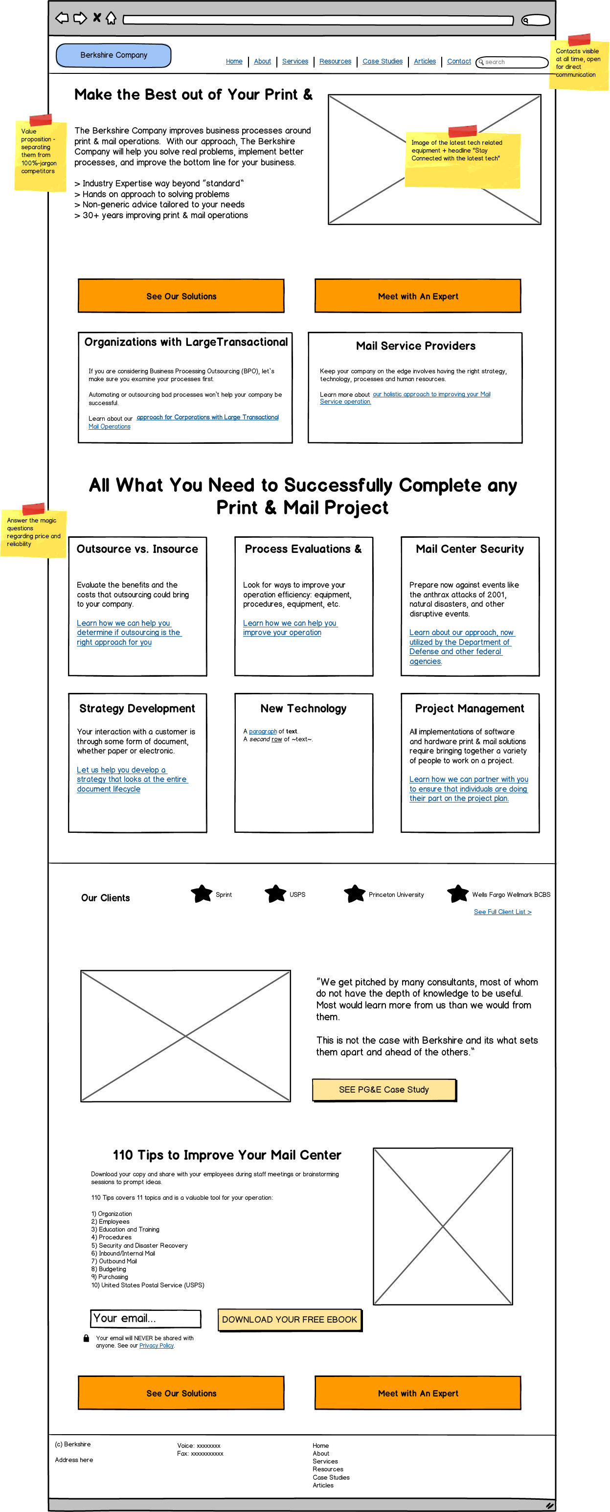
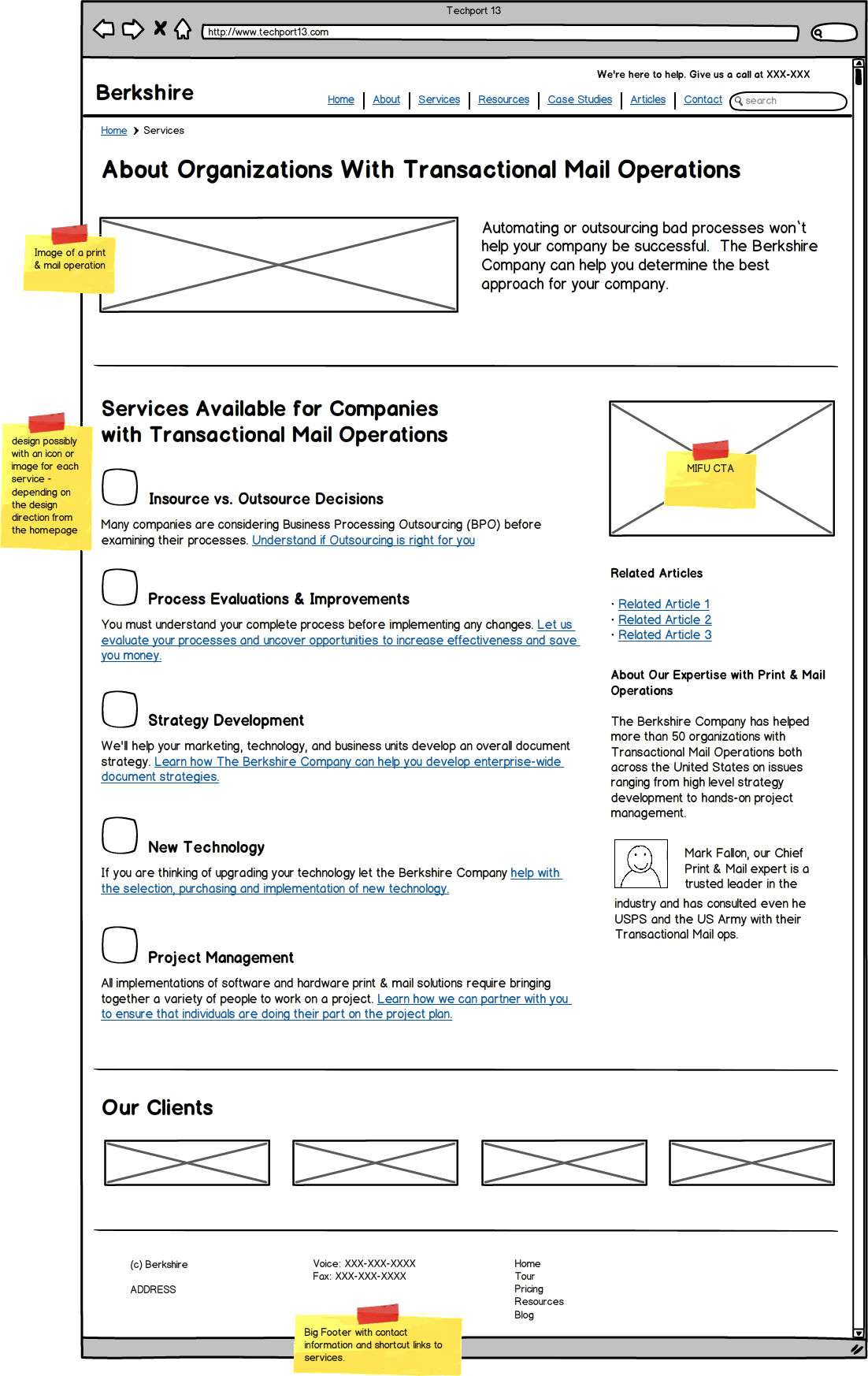
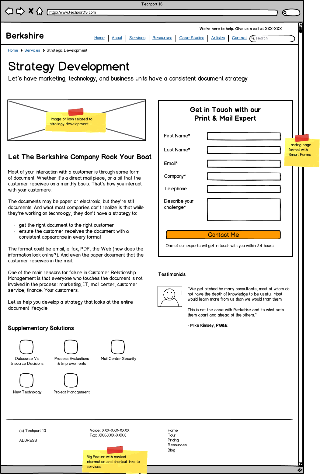
A website wireframe is where all of the previous 8 points come together and start giving shape to the website pages. You need to create and test wireframes for, at a minimum, all of the key pages in the user flows.
First step is to define what is the goal of the page you are designing; i.e. what do you want the users to know after reading the page, and what do you want them to do next.
A wireframe is a blueprint that defines the following for every page:
A wireframe allows you to look at all these elements without the noise of the look & feel. If you were to decide on all of these elements directly on the design stage without wireframing first it would be extremely confusing and soon you would start spending a lot of time discussing with your team whether the icon in the social media icon in the footer should be square or round instead of focusing on what the page is supposed to do. So don’t do that. Work in black & white first, design will come in later; in fact you can start with a sharpie just defining the layout and the flow, then you can start adding details.
This will keep conversations with your team on the right topics. In fact, you could even do user testing with your wireframes, just to make sure you catch any major usability issues.
Here are some examples of wireframes:
| Home Page | Services Overview | Service Page |
As you can see, you cannot possibly do wireframing with a ton of dummy text.You need to have at least a pretty good idea of the messaging; you don’t need final copy but at least you need to know what the overall idea is. It can’t be just dummy text all over; it would be useless.
Here are some other pretty cool examples of wireframes of landing pages:
12 Remarkable Wireframe Examples of Landing Pages
Also if you want to get more familiar with wireframing Balsamiq has some pretty good tutorials you can check out.
Lastly, before turning the designers and copywriters lose on finalizing the site you need to clarify exactly just what you want from your new site and put together some guidelines for the designers to run with.
Start by answering this simple question:
- What is the number-one most important thing that you want your site to do for you to consider it a success? -
For the majority of sites, it has to be something that means either a qualified lead or a customer.
You must define that, and everything in your website should ultimately help you to accomplish this goal. This includes your site copy, the tone of voice, the design, the layout, the structure and the graphics.
All you have to do is simply define very specifically what that means. So ask yourself:
Also the graphic designers and copywriters need to have a clear idea of the following elements:
Everything you’ve read up to now is the customer centric-websites approach. Note the sheer contrast between this very attentive and careful approach and the typical freelance-designer job or template job. With the customer centric-website approach, though, you get a targeted site as well as a design that makes a lot of sense for your buyers, instead of just beautiful-yet-empty visuals.
The moral of the story here is that you have to really put a lot of thought into your B2B website before you can jump ahead to its actual design. Sure, while that is tempting alright, nothing good can come of it. You simply cannot take any shortcuts when it comes to building a successful, effective and attractive B2B site that will give your buyers exactly what they’re looking for in a super-easy fashion.
There are at least 10 specific items outlined above that you’ll have to tackle before you should even think about the design of your B2B site. Don’t misunderstand, though: The design of your site is important as well. I Any site that looks visually attractive still won’t be effective if the aforementioned fundamentals haven’t been taken care of first.
So before you jump ahead and start working on the design of your site, make sure that you do your homework first.
Here is the other side of it: All of this work is only the first step to have a good solid effective B2B site. Once you are into it you’ll need to continue to monitor your site making tiny improvements over a long period of time as opposed to getting all this work done, and then leaving your site sitting there, forgotten until you feel you need a new redesign.
Remember you are not really redesigning a site, you should be thinking about creating a sales tool, and like any sales rep. It needs constant monitoring and coaching to become excellent.