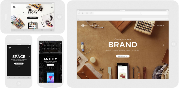
It can be hard, it’s true, to radically modify one’s website design. We live in a world that’s rapidly changing and web development has risen to the challenge. The old ways of designing websites are slowly being phased out and the new philosophy of Responsive Web Design has reached a point where little doubt is raised about its effectiveness.
“But what exactly is Responsive Web Design?” I hear you ask.
Well, it is a well-known fact in responsive web design circles that mobile web access will soon surpass desktop web access. Not only are smartphones sales skyrocketing (1 billion reached last year, and 2 billion expected by 2015), but they’re used as the primary medium for accessing the web. For example, in the US 25% of teenagers and 15% of Adults access the internet primarily through mobile. And with 61% of mobile phone users on smartphones, most companies are aware of the need for a mobile site.
This change might cause problems with your viewership. 98% of your visitors never come back to your website, so we better be fully prepared to capture the remaining 2.
Enter Responsive Web Design.
With Responsive Web Design, you’re essentially telling your customers that you understand their needs and are ready to meet them. No longer will they need to zoom in and out or scroll left and right when they access your website through their mobile devices, because your website is ready to respond to that medium.
Responsive Web Design means a fluid and flexible model that can adapt to our ever-changing internet behavior. It means that, instead of needing one web design for desktop and another for mobile, you choose a website that always fits the visitor’s screen. This ensures that your viewer is constantly getting all the information your website has to offer, instead of having part of that transformation ‘lost in translation’.
Take the website of TeamTreeHouse for example. Notice how the website responds whenever you make the screen wider and thinner? That’s because it has a Responsive Web Design. Take another example, The Baker Street Enquirer, designed by Ethan Marcotte, the father of Responsive Web Design himself. Reduce the width to near-ridiculous levels and you still know that this is about a detective, Sherlock Holmes, looking for work; the 6 images, the brief description, the menu and even the title all ‘adjust’ to change in browser’s width.
Speaking of Marcotte. It would be impossible to talk about Responsive Web Design without mentioning the man behind the idea. Marcotte’s revolutionary method was eloquently laid out in his seminal work entitled “Responsive Web Design” (obviously) which was first published on A List Apart before gaining international recognition. I couldn’t recommend it enough. Seriously, read it. You’ll get invaluable information that would certainly help you out in the early stages of your Responsive Web Designing process. Oh, and notice how companies were asking him to design “an iPhone website” because their ‘normal’ one looked weird on smartphones? This is exactly what we’re trying to avoid.
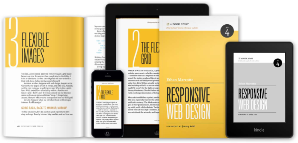
Screenshot from Marcott’s book “Responsive Web Design” published with A Book Apart
But wait a second.
The thing about Responsive Web Design for B2B is that it’s not only about making the website resize, but also about coupling it with a mobile strategy. Taking it a step further, for instance, a common conversion path for B2B companies is through white papers or PDFs. But while on mobile, downloading a PDF isn’t always an option. You might get away with it if your visitor happens to be on a tablet, but on a mobile phone? This is why Responsive Web Design is not only about resizing a site but also, and especially for B2B, it is about adapting the whole experience.
A Responsive Website On The Go
Speaking of adapting the whole experience, everyday more and more decision makers all over the world are conducting research on their mobile devices. They could be at the airport waiting for their flight, or at a business lunch with like-minded colleagues, or at some coffee break in the mood for some mobile browsing. With Responsive Web Design, your website will be ready no matter the situation. In other words, a Responsive Web Design ensures a website on the go, a website with an optimized experience.
Fluid Grids
A Responsive Website Design is dependent on something called a fluid grid. A fluid grid is the new step taken by modern responsive web designers to replace the usual rigid fixed width layouts that was preferred in recent memory. A fluid grid focuses on proportions rather than rigid pixels and would allow the layout to adapt to the width of the screen rather than crumble into an unappealing mess.
That’s basically what this is all about. A fluid grid is your way of equipping your website with a flexibility to respond to the growing multi-resolutions market. It’s basically the ultimate one formula for all sizes method. So how does it work? Well, TeamTreeHouse have provided a simple explanation as to the math behind the concept.
Examples of Awesome B2B Responsive Web Design
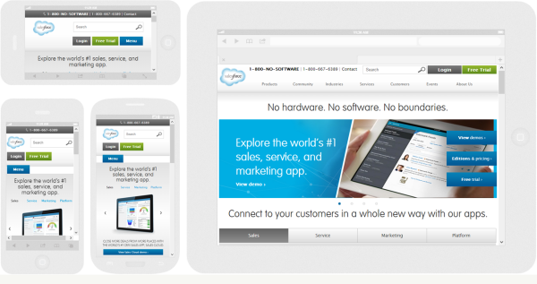
There are just so many beautiful, stylish, fun, exciting, colorful Responsive Web Designs out there that we just had to show you some.
Responsive Web Design vs Other Options
By now it should seem obvious that Responsive Web Design’s popularity suggests an element of superiority. But to put things into context, it is important to weigh the pros and cons of Responsive Web Design versus other options.
Native Apps
As the name suggests, a native application or native app is application program that has been specifically designed for a device or platform.
Pros
- Provide a slick user experience
- Can more easily access device features (camera, GPS, etc.)
- Available for offline use
Cons
- Very expensive
- Hard to do well
- Which platforms do you support?
- Your users (probably) don't want a native app
- You still need a website
Mobile-Specific Websites
These are the “iPhones websites” that Marcott talked about. Mobile-specific websites are specifically formatted for small format devices.
Pros
- Easier to optimize for speed
- More freedom to create a unique mobile experience
- Can more easily target less advanced devices, like feature phones
Cons
- Have to deal intelligently with redirects
- Ignores tablets for the most part
- Tends to offer an incomplete experience
Responsive Web Design
Pros
- Only have to maintain a single website
- Don't need to deal with mobile-specific URLs
- Addresses a wide multitude of devices: phones, tablets, desktops, etc.
Cons
- More difficult to optimize properly for specific devices (for example, phones might get desktop-sized images) -> more testing to do
Conclusion
There is no doubt that Responsive Web Design presents an exciting and new challenge for many B2B websites out there. The rapidly changing behavioral trends of potential customers deserve to be addressed. With Responsive Web Design, their needs are being upgraded to the attention they deserve. And with that, we end our brief overview of Responsive Web Design, with many more blog posts on the way.
So? What are we waiting for?


