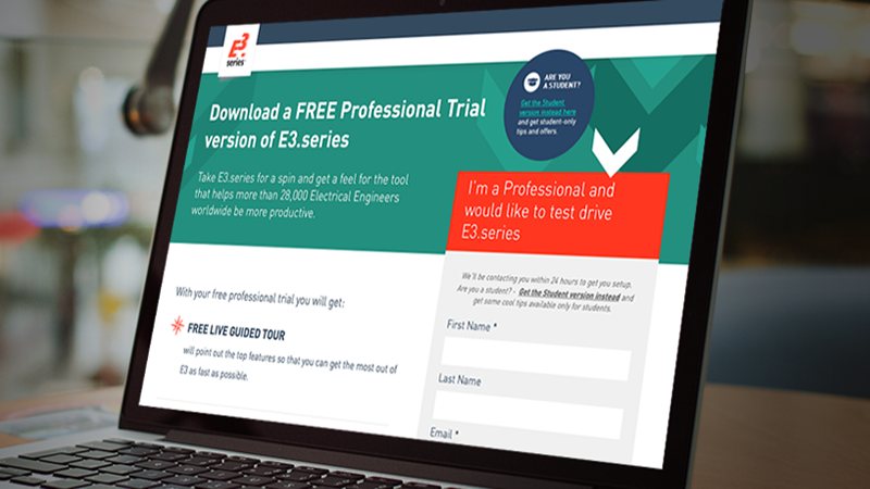
Before we get into how to make a really high-converting landing page, we want to start this blog post off by clarifying an old misconception that far too many people have about what a landing page is and is not.
Your landing page is a standalone webpage that exists for one reason and one reason only: to capture leads by getting your visitor’s personal information. Consequently, any landing page will also have a web form on it.
Technically, there are two kinds of landing pages: the click through landing page and the lead-generation or lead-capture landing page. As a B2B, you’ll usually use the latter."
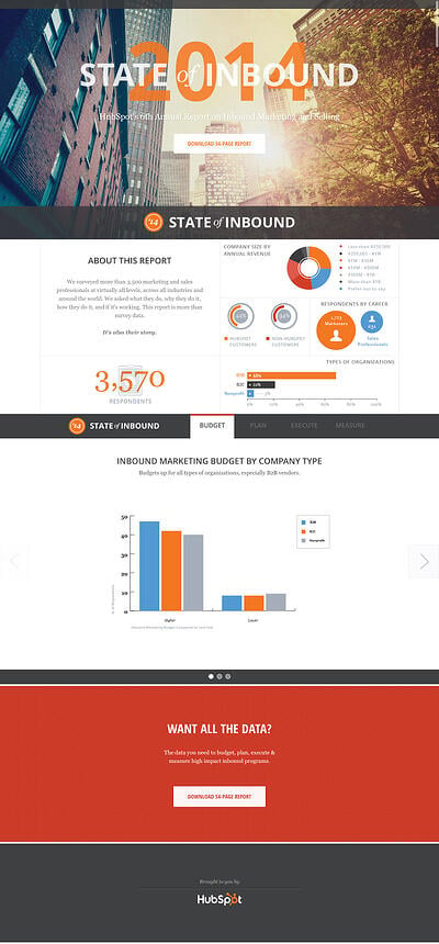
There are however some cases in which you can use a click-through landing page to give buyers more information about a the offer before they click through to the actual landing page to act on it. HubSpot’s StateOfInbound.com a good example of a click through landing page.
Now that you know precisely what a landing page is and does, let’s jump to what it isn’t because that’s where much of the confusion surrounding landing pages still exists.
A landing page is not any old webpage on your B2B website, nor is it the homepage."
While it is a webpage, a standalone one separate from your B2B site, it is not necessarily part of your site navigation.
The purpose of a landing page is to make your business more money by capturing lead information. If your landing page is stellar, then more leads will turn into buyers, thus providing return on investment. If your landing page leaves a lot to be desired…well, then you just squandered money on a bad investment.
Our blog post today is all about empowering you to design a high-converting landing page to get you more leads and more conversions. A landing page is truly the sum of its many, distinct parts, each of which we’ll look at in more detail.
Part 1. Define The Objectives Of Your Landing Page
Before you start with anything else, you should first think about your landing page definition.
PROTIP
Creating a definition of your landing page based on the ONE target persona is critical for conversions.
That’s because a definition forces you to think and remain focused on the purpose of the page. If you skip this elementary step, you run the risk of designing a page that features a jumble of competing goals and unpersuasive copy, which leads to shabby results.
Here are the most pressing questions to think about when crafting your own landing page definition:
- Who are you making the landing page for (the persona)?
- What is the specific problem of the persona that the landing page will address by offering a solution?
- What is the main assumption of your landing page?
- What is the landing page’s conversion goal (capturing leads interested in what exactly?)
- What is the stage of the funnel that your landing page complements (awareness, evaluation or decision)?
- What is the minimum success criteria of your landing page? - Special note: This is only applicable if there already was a prior version of the landing page and you are working on the challenger. Though you seek to outperform the control page, occasionally, you may want to design a new page to obtain fewer leads, but of a higher quality.
In a recent webinar about landing page design, Tim Ash, CEO of Site Tuners, discussed the concept of Conversion Centered design, and how a lot of the things that make a landing page convert are actually decided before the design process starts:
Landing page performance is not a design job. In fact, don't let your designers run the show."
Which leads us to the next part, Conversion-Centered Design.
Part 2. Embrace Conversion-Centered Design
Since getting more buyers is the purpose of a landing page, it stands to reason that your B2B must make conversion-centered design a guiding principle of its landing page.
Conversion-centered design can be broken down into numerous subareas that, together, create a powerful landing page that converts like nothing else.
A. Single offer
It has long been known that reducing choice increases conversions because it completely does away with something pejoratively called “choice paralysis.” Essentially, if you’re faced with too many choices, guess what happens? You have a hard time making up your mind, which can result in lost conversions; well:
Your landing page should focused on a single offer."
The purpose of your landing page is to focus your leads’ attention on just one goal, which is to fill out the form with their personal information in exchange for something of value (white paper, webinar, future product launch notification before anyone else, etc.).
Once you have their contact information, you can market to your leads on a more intimate level and usher them through to the next stage of your funnel.
If you fill up your landing page with too many elements like a navigation bar and links, you defeat the purpose of getting your leads to focus on the single-minded objective of filling out the form.
We always recommended including as few options as possible, on the landing page.
B. Encapsulation
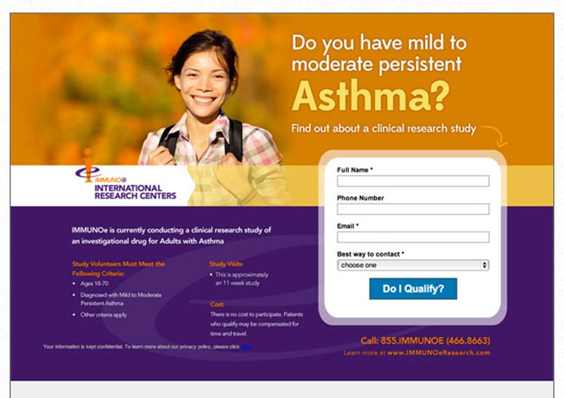
This method is great for immediately drawing the eyes of your leads by causing a tunnel-vision effect to happen. Here’s an analogy that makes 100% sense: Encapsulation creates something like a “window” on your landing page, with the call to action being the “view.”
PROTIPYou should rely on stark and dynamic shapes to restrict the points of interest on your landing page.
Like a tunnel drawing your eye, encapsulation will draw the eye of your leads to your landing page’s call to action with contrast and directional cues.
Here’s a stunning example of encapsulation from the landing page of IMMUNOe International Research Centers. The page doesn’t look like this anymore, but it’s still a perfect example of this technique on a landing page.
C. Contrast and Color
These two principles usually go together because they’re complementary. That’s because color works as a contrast mechanism itself. Color is used to call attention to your call to action button on your landing page because it makes the button pop right off the page—but only if you use contrasting colors. For instance, a big, old, red button against a white backdrop works well.
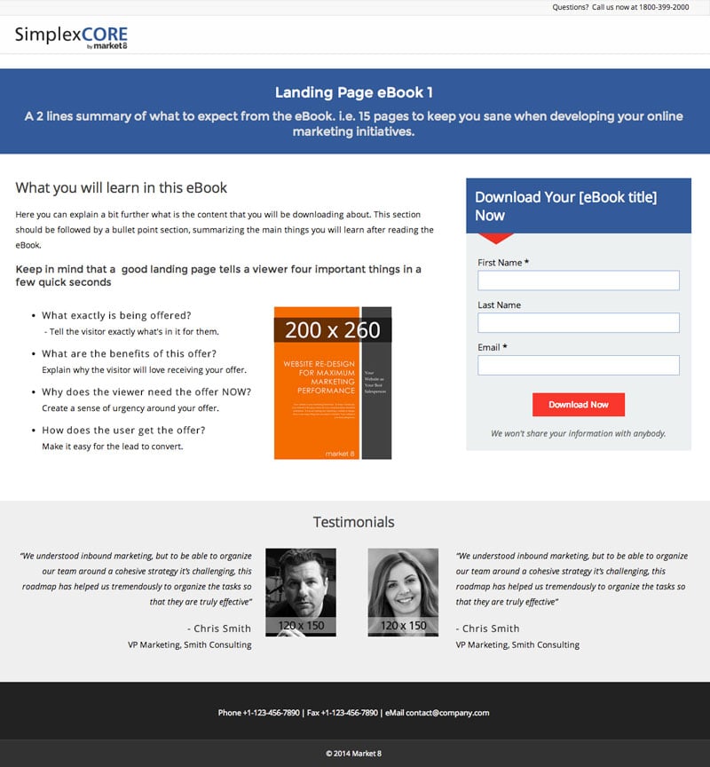
Check out the landing page template we’ve created for Simplex CORE. We’ve singled out the red color for the button and directional cue on the form. This is to capture our audience’s attention and lead their eyes to where we want them to go.
D. Directional Cues
Not too long ago, we published a blog post about using directional cues to enhance your B2B website’s user experience. In the case of your landing page, getting more conversions and the user experience are also interlinked because, the clearer your message on your landing page, the greater your conversion rate is going to be.
These directional cues give your leads unmistakable hints about what’s expected of them on your landing page, thus reducing anything being left to chance. While there is a multitude of directional cues that are possible in the user experience, today, we’re just going to focus on three highly important ones:
- Arrows
- Pathways
- Line of sight
Arrows are pretty much self-explanatory since they point people’s attention to areas of great relevance. Just think how you can use a well-placed arrow to bring your lead’s gaze to the form that you want him to fill out.
You can think of pathways on your landing page as representations of real-life roads that set off triggers in your leads’ brains that they need to follow that route.
PROTIPOn landing pages, using converging lines that meet at your extremely vital call of action is a best practice. A simple geometric shape like a triangle is ideal as a pathway since its lines converge on its vertices (which can point to your call to action).
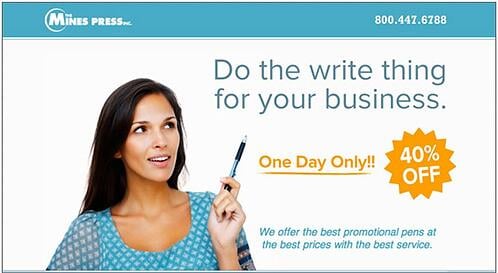
Finally, line of sight is used when an element on your landing page gazes at your call to action. The element can be a picture or a cartoon, just as long as its eyes are looking in the direction of your call to action. Line of sight capitalizes on an old, deeply hardwired habit we human beings have of using the suggestive power of the eyes to take a hard cue. If your value proposition, for example, is right above or beside a picture of someone who’s gazing at another point on your landing page—where his gaze ends would be the perfect place for your call to action.
In the landing page for Mines Press Pens, we see that the woman’s gazing up at the tagline of the company, which gets leads to start reading from the top right of the landing page and work their way down. Their gaze sequence will cover the value proposition, then message of scarcity.
And here is an heatmap that illustrates how using the line of sight drives your buyers attention towards certain elements in your landing page:

E. White Space
The use of white space or negative space is a highly effective technique to direct the eyes of your visitors to focus on what’s important on your landing page. It also helps a great deal when it comes to creating stark contrast, which, again, only assists in guiding the eyes of your visitors to where you want them to gaze.
PROTIPLet your call to action stand out prominently from the white space on your landing page by allowing enough “breathing room” between the elements on the page.
This landing page from Pear Analytics illustrates just how smartly white space can be used. Note that the white space isn’t exactly white; it’s just a solid, pale color in the background of the landing page that focuses visitor attention on the important elements of this long-form landing page. Those include the social proof, the web form, the value proposition(s) and the call to action at the bottom.

Part 3. Must-Have Page Elements
For your landing page to be a high-converting success, it must have the following page elements. Failure to include even just one of these essentials can have a noticeable, damaging effect on your conversion rates.
A. Attention-Grabbing Headline
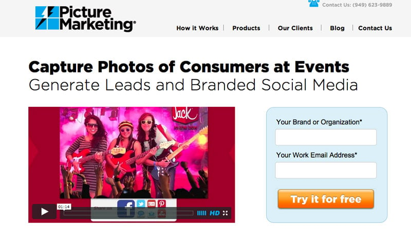
It’s sad but true, but people mostly read headlines when reading anything on the Internet. As such, you should design your landing page with that in mind by putting a killer headline where they can’t miss it: Right at the top of the page.
Keep in mind that one of the most important headlines that you will have on your site is your very own value proposition.
The value proposition communicates—a good idea would be in bullet points—the numerous ways that your product or service makes your leads’ lives easier and why it’s so much better than anything that your competition has to offer.
PROTIPHeadlines should also be concise and tell visitors what you’re selling.
Picture Marketing’s landing page is a good example of this. Note the big, short headline that also communicates what this service does.
B. Complementary Sub-Headline
The purpose of the sub-headline is to be persuasive; think of it as the second part of the one-two punch that it makes with the captivating headline. You’ll find the sub-headline just beneath the actual headline in most cases.
For a neat play on the traditional role of the sub-headline, look no farther than the landing page of HelpDesk. Note how the sub-headline is above the actual headline though its purpose is still the same: to be persuasive and support the bigger headline.

C. Good-Looking Images
Finding the right photographs to use for your page can initially prove to be a difficult task. However, you sometimes must use images on your landing pages. The real trick here is knowing what to use as an image.
For starters, feature only high-quality images that, if possible, feature real people (your employees, team, customers, etc.). That’s not all though.
You also want pictures that are bigger and higher quality rather than poorer smaller ones. They also have to be relevant to the product or service you’re selling (ask yourself, does it make sense to include this image on my landing page?).
When you think you’ve finally found the right photo, ask yourself two questions this. First, “Does it help my users understand the offer?” and second, “does it help the goal of the landing page?” If the answer is yes to both questions, then you’ve selected the appropriate photo for your landing page. If you’re uncertain of your answer to those questions, chances are that the image you have selected is actually distracting your users.
Ask yourself two questions. First, “Does it help my users understand the offer?” and second, “does it help the goal of the landing page?”
Shutterstock understands this, which is why the image in its header is high-quality and features a collection of different items that are all prominently displayed.

D. The Explanation
An explanation’s fundamental since you want your leads to be 100% clear on what product or service you’re offering them.
PROTIPAlways go with an informative and concise explanation over one that’s oozing with cutesy words. Feel free to integrate your explanation with your headline, but it isn’t a necessity.
Finally, make sure that your explanation highlights the benefits of your product or service because that’s what leads really only care about.
Make sure you format the key benefits in the form of bullets to give them quick, relevant, straight to the point information.
E. The Brief Web Form
Your landing page’s web form is the rock star of the entire page. As we’ve written in a very stimulating, previous post, it’s the unsung hero of your landing page since it can make or break your whole operation.
PROTIPThat’s why it’s in your best interest to keep said form short by using fewer fields and asking for less information from leads. Research backs this up, just having one to three fields on a form can increase conversions.
Keeping that in mind, only ask for what is needed because the more you ask, the less conversions you will make.
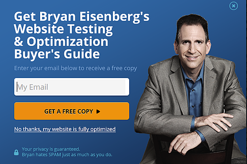
One landing page that can be looked at as a great example of not overwhelming leads with fields is the one for Bryan Eisenberg’s ebook. The pop-up form is super-quick to fill out because it only has one field, so it is a good combination of low friction + instant gratification.
F. Last but Not Least…The Call to Action Button
Together with your web form, the call to action button is the most significant element of your entire landing page. After your leads have been persuaded to fill in their contact information, they have to send it to you, which is where the call to action comes into play. Callout: Using a sub-par call to action button or copy can cause people to abandon your form, even if they were committed to filling it out.
Necessary features of your call to action button include:
- Size: make it HUGE
- Wording: avoid the rote “submit” and go with something more compelling and persuasive
- Color: use a loud color that stands out from the landing page background and offers stark contrast
- Microcopy: include a line of text that addresses the biggest doubt, fear, or concern your buyers have before clicking the button
Bryan Eisenberg's ebook example above has it right using action copy "GET A FREE COPY" in the button, and builds contrast nicely with the line right below: "No thanks, my website is fully optimized." Further down he uses microcopy to eliminate the doubts about privacy and legitimacy and does so in plain English terms.
Conclusion
By designing your landing page like we talked about above, you should be able to increase the likelihood of getting more conversions. Your leads can’t be persuaded to submit their contact information if you don’t do a stellar job at convincing them to do so. When you take the time to include all of these elements into your landing page in a meticulous way, you guide your leads through the page, thus enhancing your page’s conversion rate.
PROTIPSince your landing page is instrumental to getting more buyers, we recommend that you closely look at all page elements that we discussed and reflect them on your B2B’s landing page. Your bottom line depends on it, and you want your landing page to be a phenomenal return on investment…not something that wastes money and that you abandon after a while.
What aspects of your landing page can you improve?
Is everything spelled out clearly on your landing page?
Are you currently using a landing page in your marketing efforts?


